Plot a summary of the mapping result
plot_mapping_result.RdPlot a summary of the mapping result
Usage
plot_mapping_result(x, y, ...)
# S4 method for class 'SingleCellExperiment,MappingResult'
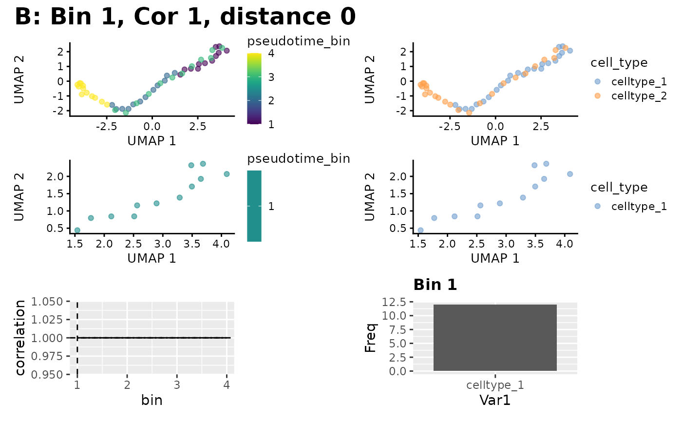
plot_mapping_result(x, y, group_by_slot)Arguments
- x
An object to plot on.
- y
The MappingResult object to plot
- ...
additional arguments passed to object-specific methods.
- group_by_slot
String. The metadata column in the SingleCellExperiment::SingleCellExperiment to be used as the coloring for the output plot. Passed to
scater::plotUMAP()ascolour_by, and will be used to produce a bar chart of populations in the best mapped bin.
Examples
counts_matrix <- matrix(
    c(seq_len(120) / 10, seq_len(120) / 5),
    ncol = 48, nrow = 5
)
sce <- SingleCellExperiment::SingleCellExperiment(assays = list(
    normcounts = counts_matrix, logcounts = log(counts_matrix)
))
colnames(sce) <- seq_len(48)
rownames(sce) <- as.character(seq_len(5))
sce$cell_type <- c(rep("celltype_1", 24), rep("celltype_2", 24))

sce$pseudotime <- seq_len(48) - 1
blase_data <- as.BlaseData(sce, pseudotime_slot = "pseudotime", n_bins = 4)
genes(blase_data) <- as.character(seq_len(5))

bulk_counts <- matrix(seq_len(15) * 10, ncol = 3, nrow = 5)
colnames(bulk_counts) <- c("A", "B", "C")
rownames(bulk_counts) <- as.character(seq_len(5))

result <- map_best_bin(blase_data, "B", bulk_counts)

# Plot bin
sce <- scater::runUMAP(sce)
sce <- assign_pseudotime_bins(
    sce,
    pseudotime_slot = "pseudotime", n_bins = 4
)
plot_mapping_result(sce, result, group_by_slot = "cell_type")